Sunday, 9 October 2011
Street Furniture- Advertising Project
The aim of this product was to create 3 advertisments in an outdoor situation. We had to choose 3 different brands to advertise in the same outdoor space. I chose to do Lego, Durex and Red Bull, and the advertisment space is Clearwater Mall
My whole concept behind the 3 ideas was interactivity with the public, as well as using the public to form part of the advertisment when viewed from the 2nd story of the shopping centre.Here are the 3 advertisments in-situ.

 For the Lego brand a maze made to look like Lego was created to form the Lego logo. The public can then walk through the logo which reinforces the Lego slogan "play on...".

 For the Durex brand the Durex logo was used and turned into a maze with no exit. This advertises the fact that Durex condoms have no exit. The public that walk through the structure will aid the advertisment seen from the 2nd story as they will just keep coming out they way they went in.

 For the Red Bull advertisment the logo is flat on the floor with enlarged cans on top of it. The cans are attached to a pulling system where people can go and lift them up. There are also wings attached to each can so that as the can is pulled up the wings open. The tables on either side of the logo are there to give away free Red Bull to the public so that they will be energised enough to go and pull up the cans.
My whole concept behind the 3 ideas was interactivity with the public, as well as using the public to form part of the advertisment when viewed from the 2nd story of the shopping centre.Here are the 3 advertisments in-situ.


Thursday, 1 September 2011
Stop Frame Animation
The theme for my stop frame animation is stereotyping with focus on social stereotypes in society. The song playing (The Parlatones- Colourful) focuses on colour and gives a light, fun feeling to the animation.Each stereotype features a colour showing that even though we might be seen as one colour that we are all really just colourful. the frames show how society stereotypes different people.
It took 10 hours to shoot all 720 photographs to make up a 1min animation and a additional day to edit as the font was placed in afterwards in illustrator. The model is Denieme Spenceley.
Hope you enjoy it...
It took 10 hours to shoot all 720 photographs to make up a 1min animation and a additional day to edit as the font was placed in afterwards in illustrator. The model is Denieme Spenceley.
Hope you enjoy it...
Monday, 20 June 2011
Bootcamp at GDC
At the beginning of the year we took part in a bootcamp, which was like an introduction to 2nd year graphics design. This year was completely different to last years bootcamp where we where all mixed up from 1st years to 3rd years and had to keep swapping classes and lectures. For that reason I found that this years bootcamp aided us much more and introduced us into 2nd year very well as we were with our lecture that would be teaching us for the whole year. We did exercises that helped us get into the swing of things and see what was expected from us. During the bootcamp we created the logo that appears on this blog and the blog itself.
Sunday, 19 June 2011
Typography Design Project


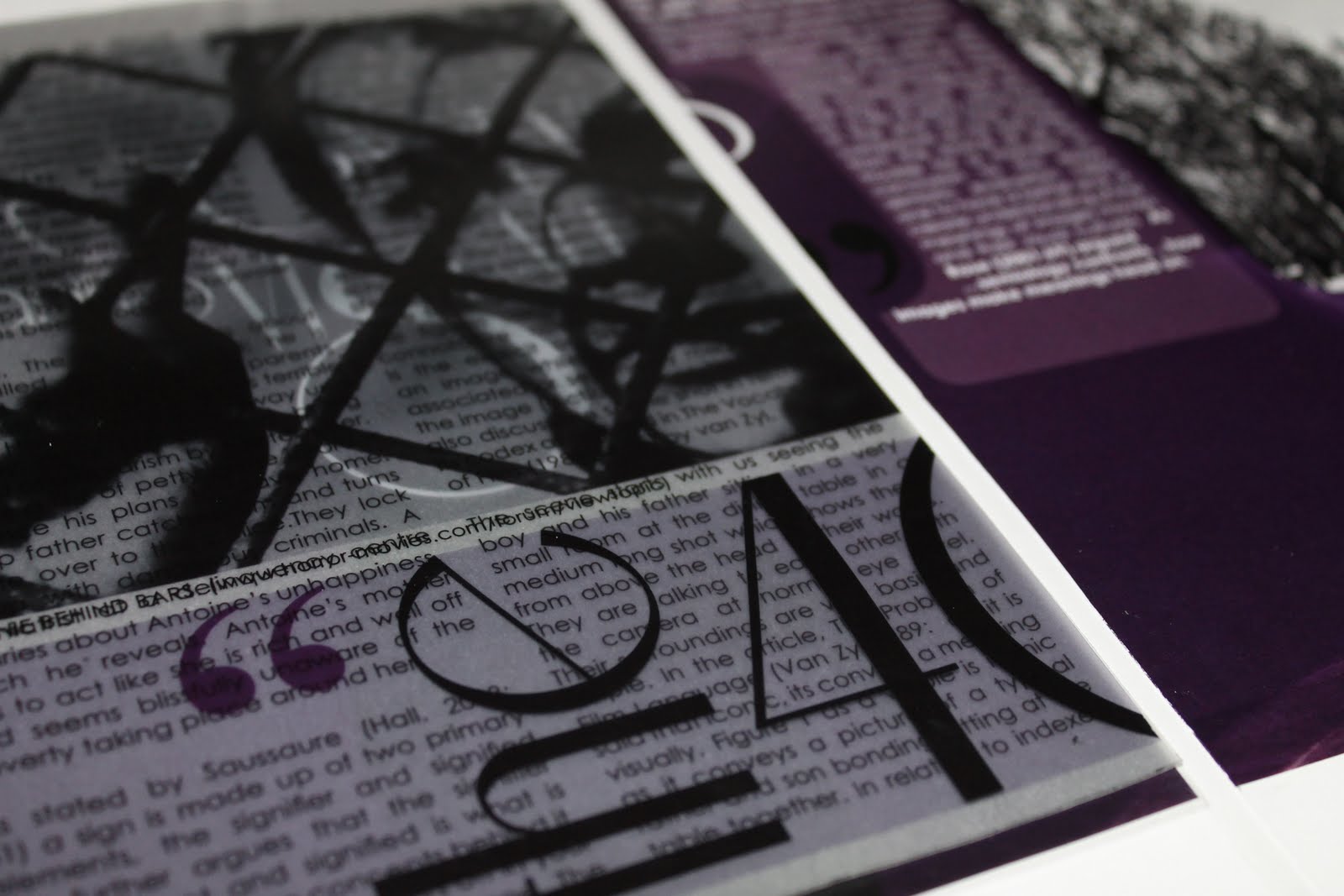
Editorial Design Project (copy cat)
In this project we where tasked with redesigning an inspirational editorial by making it better, different and more creative while using our critical studies essay in the editorial. We than had to swap the redesigned editorials with 2 of our peers and redesign theirs using our own essays.
Pop-up Editorial


Layered Editorial

Perforated Editorial


Wednesday, 15 June 2011
Packaging design for design emergancy


Monday, 16 May 2011
photo farm
in this project we were given photography tutorials to complete everyday. Theses are the best ones

Smoke effect- this was made using incense sticks and then mirrored in photoshop to create this alien

Polarise effect- this is created by placing plastic objects in front of a computer screen and then photographing it using 3D glass lenses placed in front of the camera lenses

xray- a scanner was used to scan this shell into photoshop and the inverted to make it look like an xray

Torch- by using a very slow shutter speed in a dark room this torch light was captured

Rule of Thirds- this images was taken with referance to the rule of third, the focal point is on the 1/3 t the left

eye- in order to get the detail in the eye there has to be natural sunlight and extrem close up

Water drop- this requires expert timing and patience as you need to capture the water as soon as the drop hits it

Fine food art- We had to thinly slice fruit and place it on a light box to get all the detail in the fruit


Torch- by using a very slow shutter speed in a dark room this torch light was captured


![]()
Subscribe to Comments [Atom]